
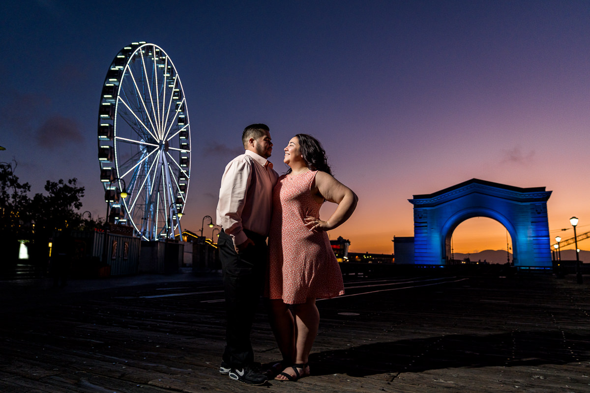
July 16, 2026
Picking outfits for your engagement session sounds simple. Then you’re standing in front of your closet, not sure if what you’re wearing is actually going to work. Most couples think about style and comfort, which matters, but there’s something that gets overlooked almost every time: how your clothing colors interact with the location you’re shooting in.
This is something I think about constantly as someone who approaches photography through a cinematic lens. The same principles that Hollywood cinematographers use to make their subjects pop off the screen apply directly to how you should be thinking about what you wear to your session. Once you understand how color works in this context, outfit planning becomes a lot less stressful, and your photos become a lot more striking.
The Basics: Why Color Matters More Than You Think
There’s a reason certain photos stop you mid-scroll, and others blend into everything else you’ve seen that day. A huge part of that comes down to color relationships between the subject and the background.
The core concept is this: colors that sit opposite each other on the color wheel create contrast. When that contrast exists between you and your surroundings, your eyes are naturally drawn to the subject, which in this case is you and your partner. Colors that are too similar to the background cause you to blend in, which is the last thing you want when these photos are supposed to be about the two of you.
Hollywood has known this for decades. The reason the teal and orange color grade became so dominant in blockbuster cinema is that it exploits this exact principle. Human skin tones naturally fall in the warm orange range of the color spectrum. When filmmakers push the shadows and backgrounds toward cool teal, the subjects literally separate from the environment and step forward. The background recedes. The people pop. That’s not an accident, it’s intentional color science applied to storytelling.
You can use the same thinking when choosing what to wear.
Reading Your Location
The first step is thinking about what colors are going to dominate the location you’re shooting in. Every environment has a color palette, and once you can identify it, you can choose clothing that works with or against it strategically.
Forest and Wooded Locations

Forests are dominated by greens and browns. Deep olive greens, mossy tones, warm earthy browns, the occasional burst of yellow light filtering through the canopy. These are the colors that will fill the background of your photos.
The complement of green on the color wheel is red, which means anything in the red, burgundy, rust, or terracotta family is going to pop beautifully against a forest backdrop. You can see exactly this at work in one of my sessions at the Seal Cove Cypress Tree Tunnel, where a burnt orange shirt against the deep green grass and dark tree trunks creates an immediate visual separation. Your eye goes straight to the couple without any effort. Dusty rose and blush also work surprisingly well because they contrast with the green without fighting it. Warm neutrals like camel, cream, and soft tan sit in harmony with the earthiness of the environment while still reading clearly enough to separate you from the background.
What to avoid: anything in the olive, khaki, or dark green family. You’ll blend into the trees and lose definition in the photos.
Garden and Floral Locations

Gardens tend to have a mix of warm and cool tones depending on what’s in bloom, but the dominant palette is usually green foliage with warm ambient light filtering through. One of my favorite sessions at Filoli Estate shows exactly how well a coordinated blue and white pairing works in this kind of environment. The cool tones of their outfits separate cleanly from the warm golden bokeh behind them. Because they chose complementary shades of the same cool palette instead of identical outfits, they look like a couple, not a matching set.
Beach and Coastal Locations
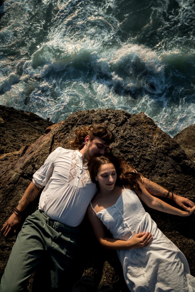
The beach gives you sand in warm tawny browns and tans, ocean in deep blues and blue-greens, and usually a lot of bright open sky. It’s a naturally beautiful backdrop, but it can swallow you if you don’t think about contrast.
For a session at Elk Head Trail, the couple wore soft white and white tones against dramatic dark rocks with the teal ocean crashing below. There’s very little color contrast at work here, but the value contrast, meaning the difference in lightness between their light outfits and the dark, moody rocks, does the heavy lifting. Your eye finds them immediately. It’s a different approach, but it works just as powerfully.
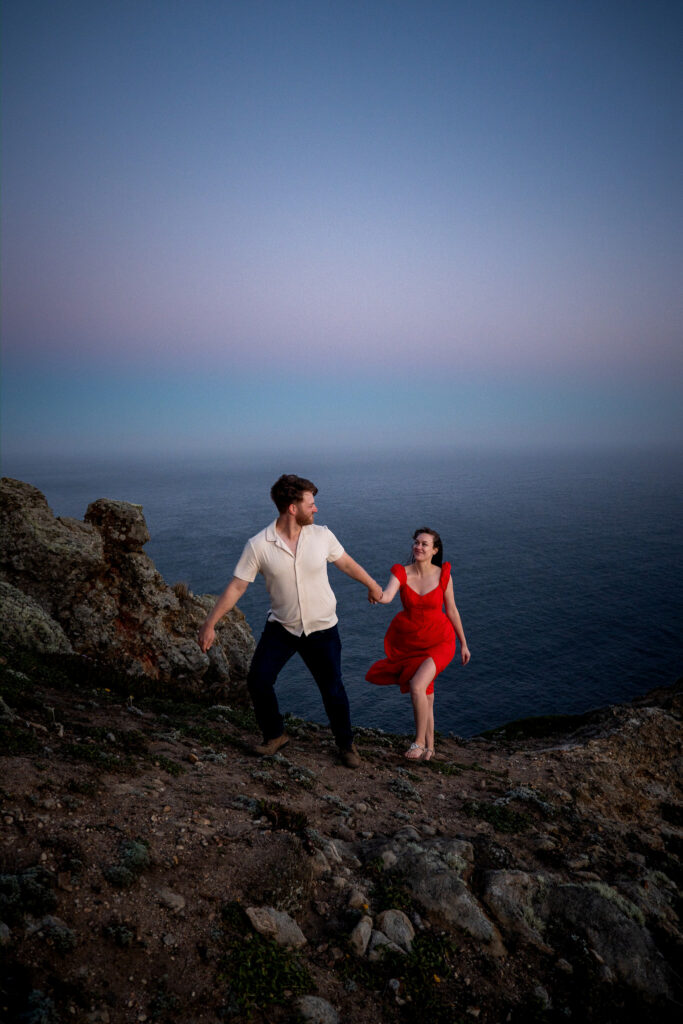
For more color-driven contrast at the coast, warm tones that sit opposite the cool coastal palette are incredibly effective. At a clifftop session at Point Reyes, a red dress against the cool blue ocean and fading twilight sky is one of the clearest examples of complementary color theory you’ll ever see in a real photograph. The red is literally the only warm saturated color in the entire frame and your eye goes straight to the couple without hesitation. Terracotta, burnt orange, soft coral, and warm white all work similarly well at coastal locations.
If you love the idea of blue tones at the beach, go for something deeper and more saturated rather than a light, airy blue, which will disappear into the sky. Navy can work well because the depth of the color gives it enough weight to still read clearly.
Urban and Architectural Locations

Cities and architectural settings tend to be neutral, lots of concrete, grey, warm stone, brick tones, and muted urban palettes. This actually gives you the most flexibility of any environment because there’s less dominant color competing with you.
The Palace of Fine Arts is a great example of jewel tones reading powerfully in an architectural setting. Deep burgundy and navy against the warm golden architecture creates a palette that feels rich without being overwhelming. The two outfits are completely different colors, but they belong together, which is exactly what coordinating without matching looks like in practice.
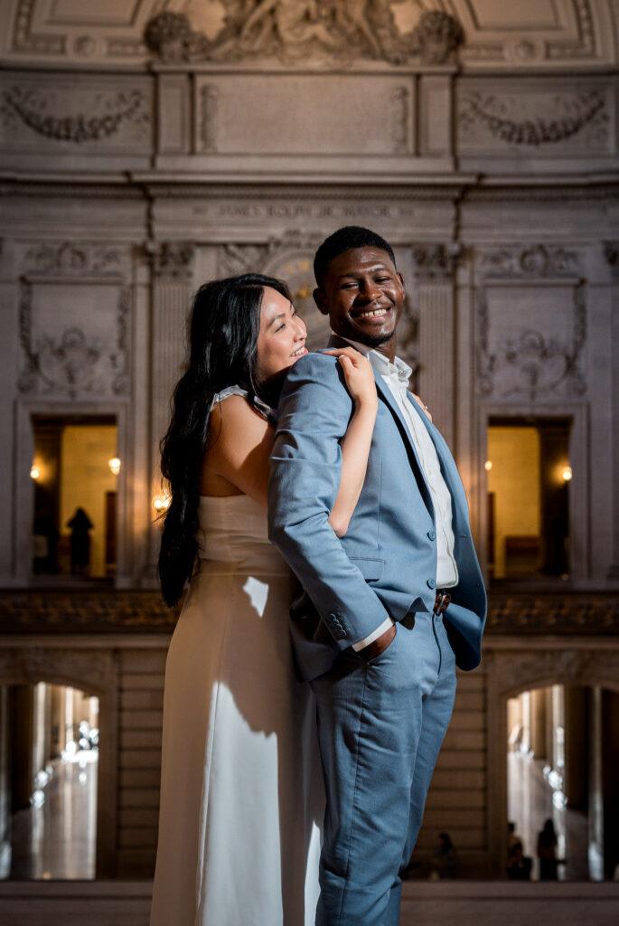
San Francisco City Hall takes a more understated approach. A soft blush white dress and steel blue suit against the ornate warm stone interior provides just enough contrast without competing with the grandeur of the space. It’s elegant, and it works precisely because neither outfit tries to dominate the environment.
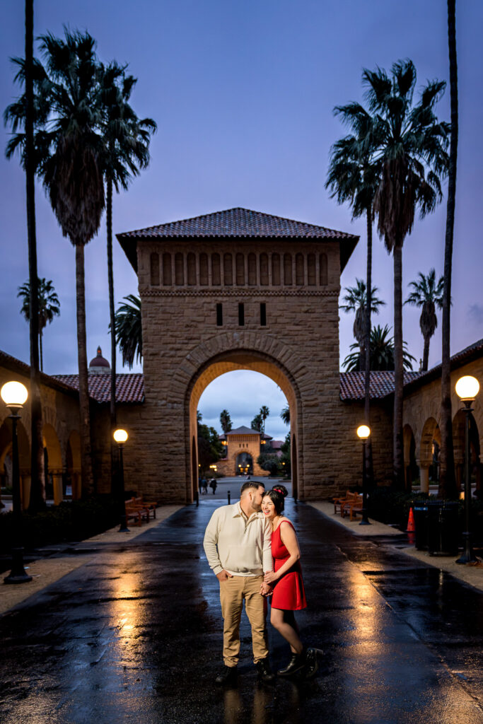
Stanford shows the same principle as the clifftop session, but in an architectural context. When the rest of the frame is cool and neutral, a single warm saturated color becomes the anchor point of the entire image.
Dressing as a Couple: Coordinated, Not Matching
One of the most common mistakes couples make is wearing the exact same color or matching outfits. The intention is usually to look cohesive, but what it actually does is make you look like siblings rather than two distinct people who are in love.
The goal is to coordinate, not match. Think of it like a film’s color palette: there’s a relationship between the colors, but they’re not identical. Start with one person’s outfit and build the other around it. If one of you is wearing a dusty rose dress, the other might wear a neutral cream or soft tan rather than another shade of pink. The two outfits should feel like they belong in the same world without being copies of each other.
Vary the saturation. If one outfit is more vibrant or saturated, the other can be softer and more muted. This creates visual balance without creating visual monotony. Pay attention to value as well, meaning the lightness or darkness of the colors. Two very dark outfits can compete with each other. Two very light outfits can wash out. A mix of light and slightly deeper tones within a coordinated palette tends to create the most interesting and dynamic photos.
Texture differences also help a lot. Even if the colors are similar, varying fabrics and textures give each person visual distinctiveness within the frame.
A Note on Bold Colors
Don’t be afraid of them. A bold red dress against a cool coastal backdrop, a deep emerald against a neutral urban wall, these choices can be incredibly powerful because they create instant contrast that draws the eye straight to you. The key is that the color should work against the environment rather than compete with it. When it does that, it can be one of the most striking choices you make.
A Few Things to Always Avoid
Regardless of the location, there are a few outfit decisions that tend to cause problems in photos across the board.
Very busy patterns and small stripes create a moiré effect on camera, which is a visual distortion that looks unintentional and distracting. Subtle textures are fine, but keep patterns simple.
Logos and text on clothing date your photos immediately and pull the viewer’s attention away from your faces and your connection.
Matching your outfit to the location exactly, while it might seem like a fun artistic choice, tends to make you disappear into the background rather than stand out from it.
When In Doubt, Ask
Before your session, I send all of my couples a style guide, and I genuinely love being part of the outfit planning process. If you want to send me photos of what you’re considering, I’ll give you honest feedback. If something isn’t going to work in the location we’ve chosen, I’ll tell you, and if it looks great, I’ll tell you that too.
The goal is always for you to feel like yourselves while also giving your photos the best possible chance of being exactly what you hoped for.
If you’re still figuring out the rest of your engagement session planning, here’s how to prepare for an easy, enjoyable engagement session. Ready to start talking about yours? Let’s chat.
